FAWLS: Expressive Design
But what if they didn't have to be?
I reimagined the Fish and Wildlife Licensing Service (FAWLS) to feel more human and joyful, using real Ontario assets, playful visuals, and small moments of delight potentially reaching 1.5M licensed anglers across Ontario.
From splash screens to loading animations and tag validation screens, I designed 3 distinct motion assets (1 launched, 2 in progress) across 3+ design iterations to refine every detail. This ongoing work explores micro-interactions that transform wait time into tiny experiences of joy.
Because even public tools can spark joy
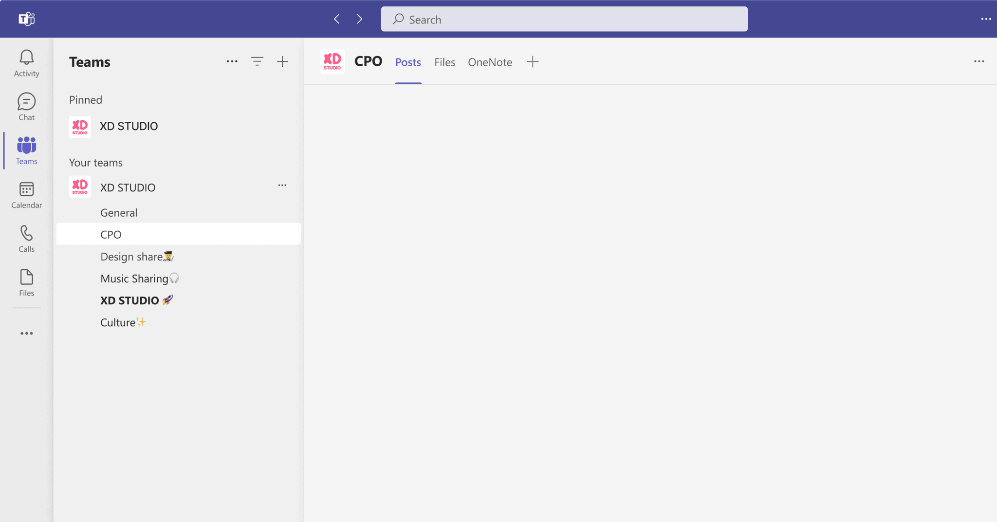
XDSTUDIO: Visual Identity
From logo and motion design to presentation templates and Teams backgrounds, I shaped a bold, cohesive presence across government. I worked closely with 7-person design team through multiple iterations, aligning on look-and-feel, functionality, and brand vision to meet stakeholder needs.
Today, my system powers executive decks, cross-ministry outreach, and internal communications, helping XD Studio show up not just professionally, but memorably. XD


Consumer Protection Ontario (CPO)
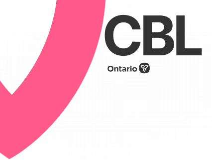
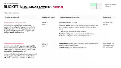
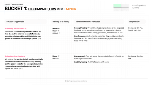
I co-led discovery for CPO’s Consumer Beware List and eComplaint form alongside 3 UX designers under 1 manager, collaborating with a 16-member cross-functional team. Over 4 Lean UX Canvas workshops, we uncovered the business problem, user problem, and opportunity space while surfacing key insights, assumptions, and validation paths to guide design priorities.
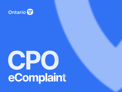
For the eComplaint form, I personally led product discovery, uncovering a critical bug that shaped our direction, and conducted a heuristic evaluation to identify usability issues. I facilitated multiple review cycles with stakeholders, completed a severity ranking exercise with input from all 16 team members via a shared Excel sheet, and captured the results in a Lean UX Synthesis deck complete with rationale, validation opportunities, and next steps.
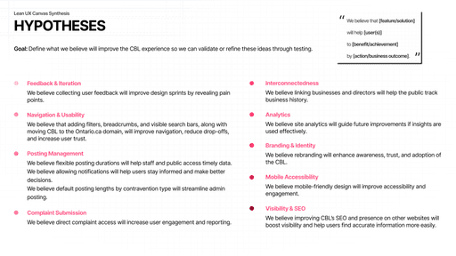
I also delivered a walkthrough presentation to align the team, refined the Scope of Work, and co-developed the Validation Activities deck, laying the foundation for measurable improvements to public trust and usability. While exact CBL and eComplaint usage figures aren’t public, ontario.ca receives nearly 11 Million visits per month, underscoring the scale and potential impact of improving these high-visibility government services.


Aadi
Kelly
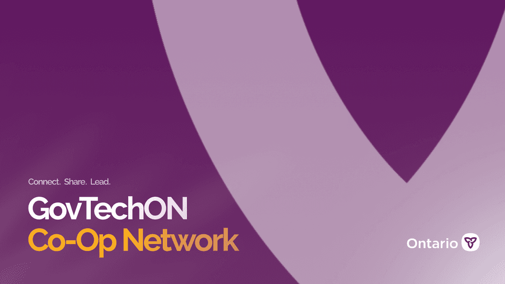
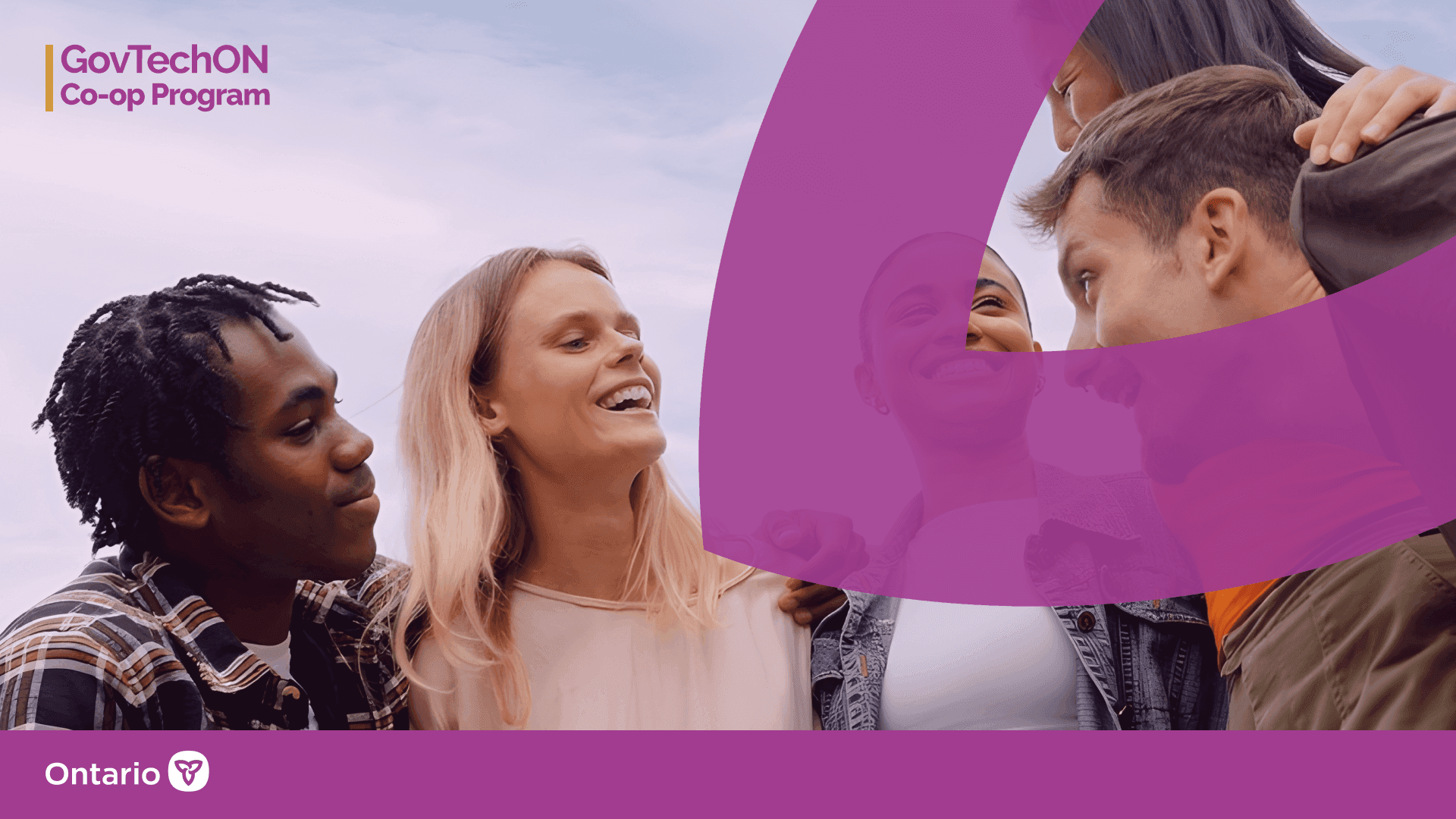
GTOCP (GovTech Ontario Coop Network)
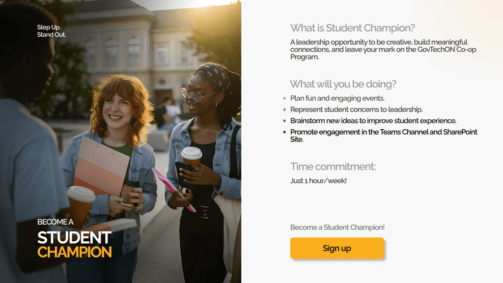
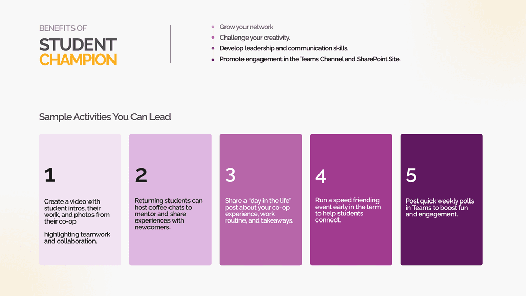
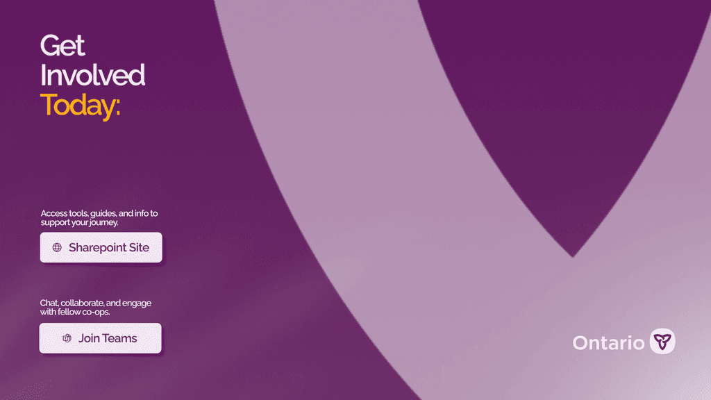
I shaped the OPS Co-op Network’s visual identity logo, colors, Teams assets, and executive decks giving 596+ students across government a stronger voice and presence. I also supported the launch of its SharePoint site, a central hub curating everything co-ops need to succeed, from onboarding guides to event updates and student stories.
To amplify its reach, I co-led a video campaign featuring 10 students and working with 29 student champions to lead events, represent student concerns, and drive engagement across Teams and SharePoint building a stronger, connected co-op community.
Brand colors inspired by ODS,
accessible, official, and vibrant
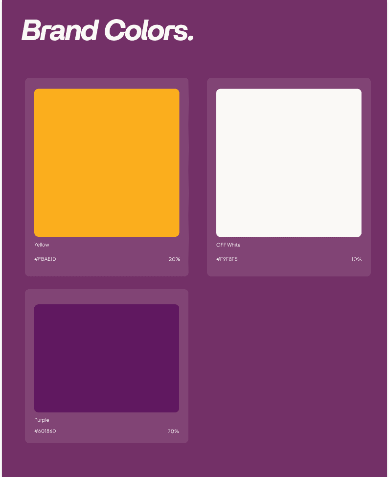
Used colour shades to guide hierarchy, with tight, scannable text for clarity.
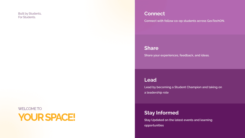
Used relatable imagery, playful shapes, and layout to connect with students and keep engagement high.
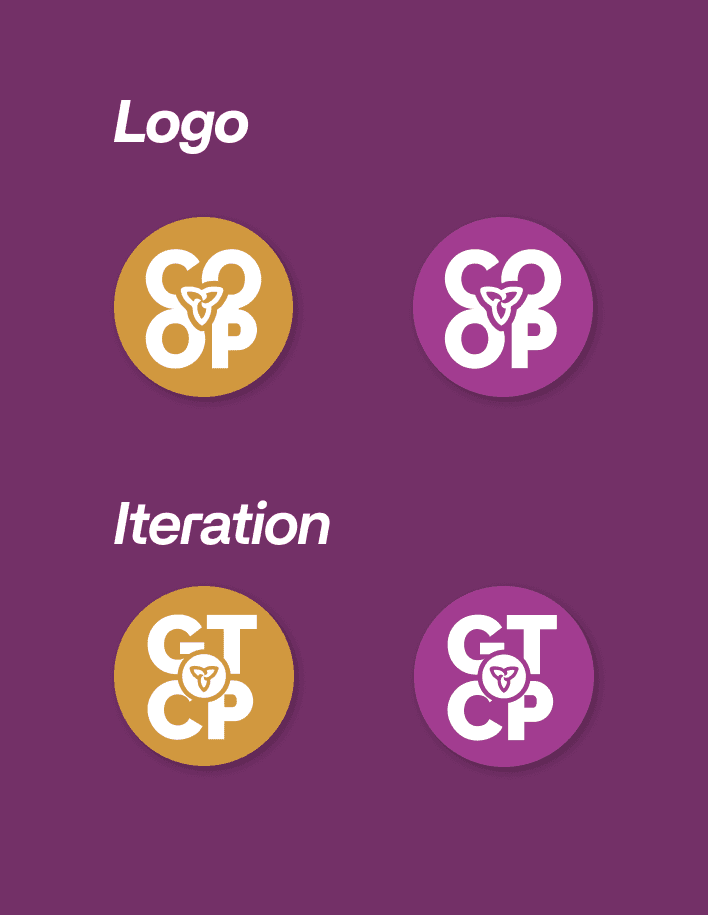
logo 1: Trillium sits at the core, tying together 'co-op'
Iteration: The Trillium sits inside the 'O' of GTOCP putting Ontario at the heart of the logo
Created two Teams backgrounds: one clean and minimal for clarity, the other with imagery to capture student spirit.
Ontario Data Platform (Visual Storytelling)
I transformed complex, technical concepts into clear, engaging narratives by owning the entire creative process from scripting and storyboarding to sketching, motion design, and sound.
I led the creation of 4 animated explainer videos that became a core onboarding tool for ODP, with 3 undergoing multiple revisions to meet evolving stakeholder needs. I also produced comprehensive documentation covering the process, design decisions, and changes. These assets streamlined onboarding, improved adoption, and helped both technical and non-technical teams collaborate more effectively.
"Click a thumbnail below to watch full video."
OPS Events & Communication Design
I have created 14 high-impact presentation decks that distilled design reviews, usability research, and product strategies into clear, engaging visuals. These became a go-to tool for communicating insights, aligning stakeholders, and driving decisions across OPS ministries.
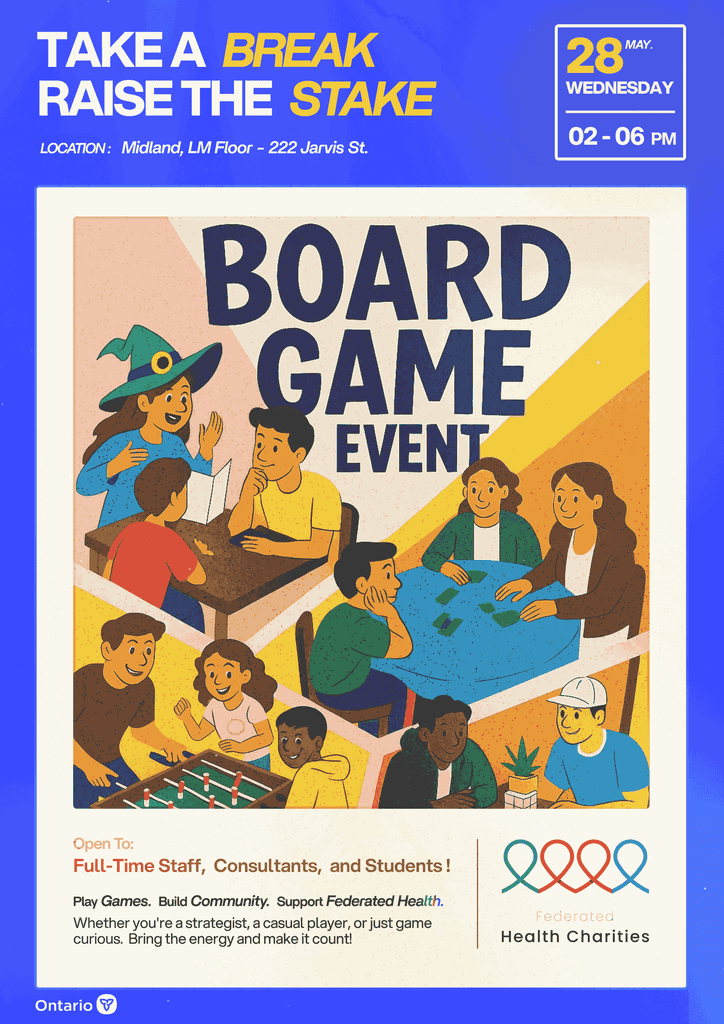
Beyond digital screens, I brought OPS events to life with cohesive visual branding. From the Federal Health Charity campaign to ministry-wide gatherings, I designed digital and printed banners for events with 110+ participants, strengthening culture, encouraging engagement, and ensuring every event looked polished and on-brand

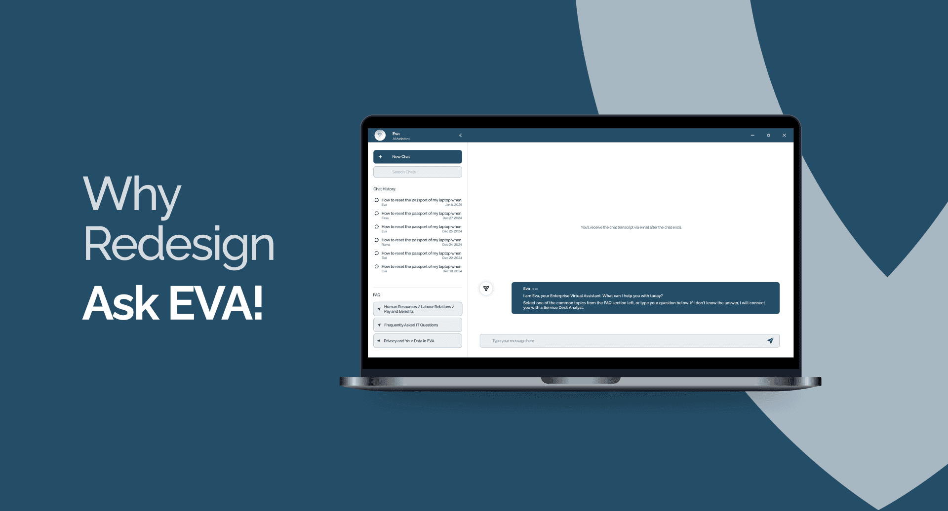
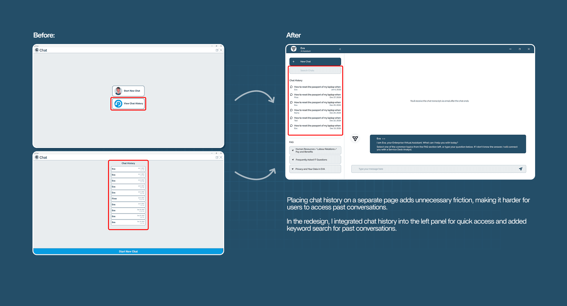
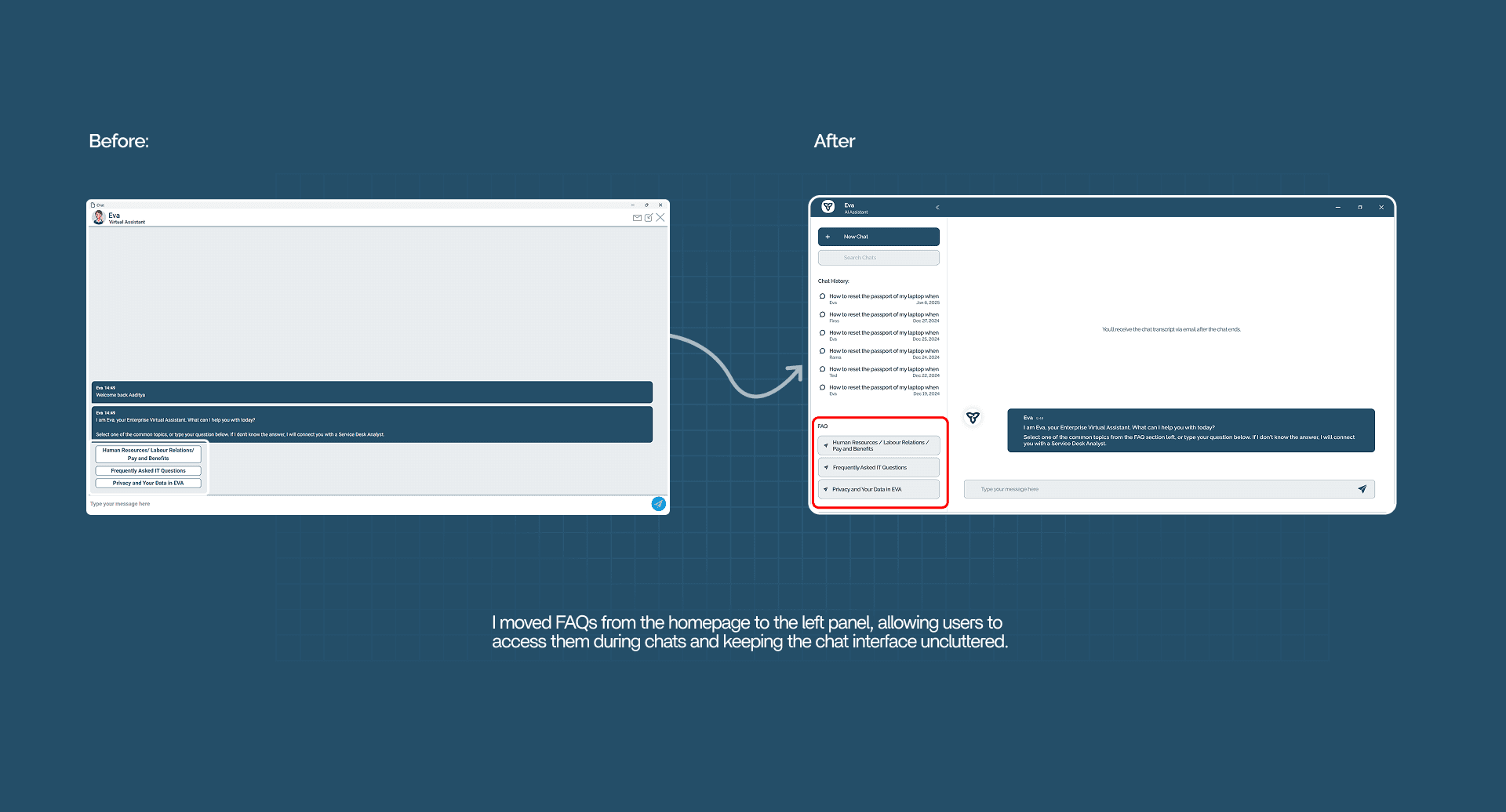
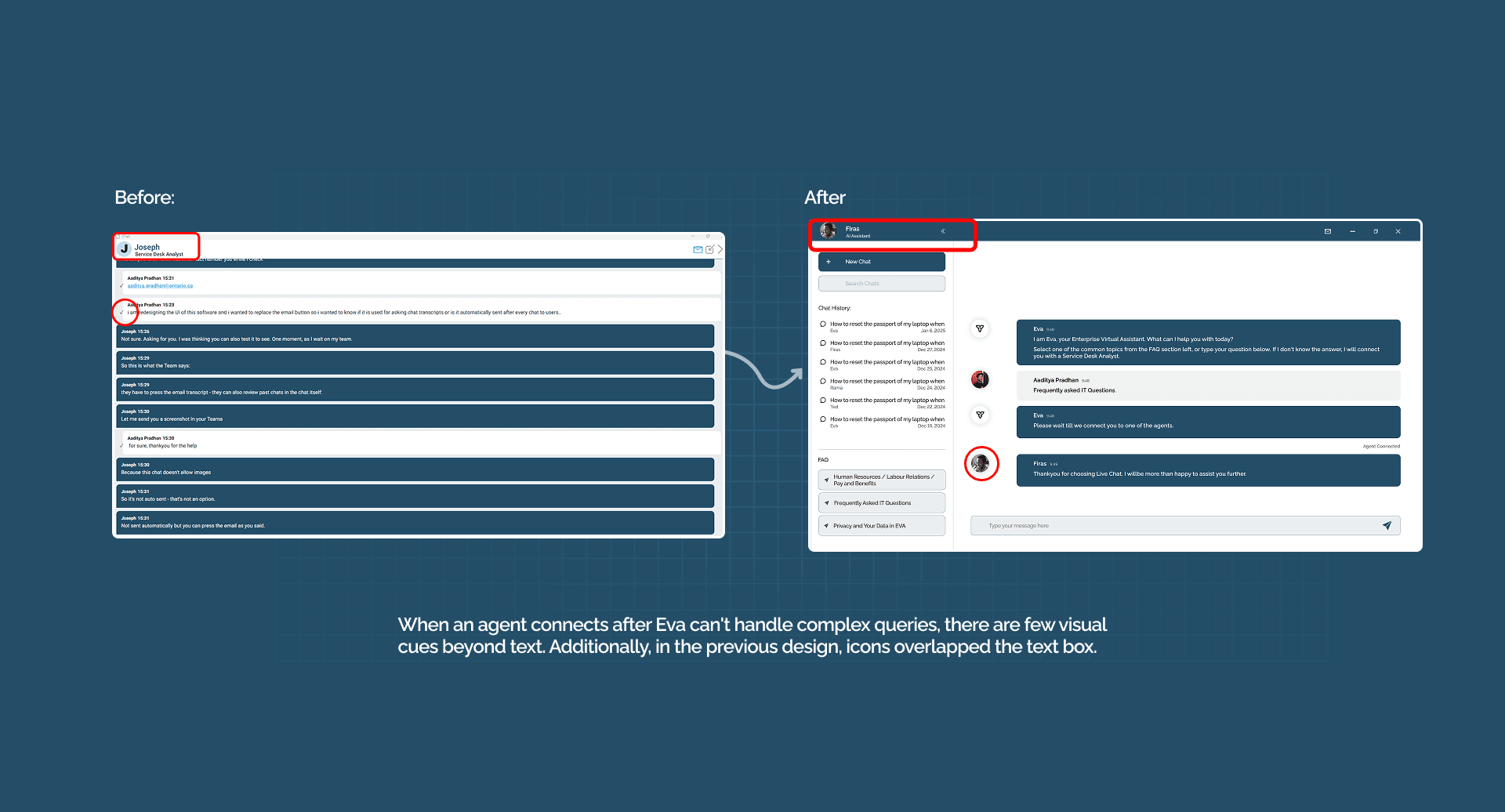
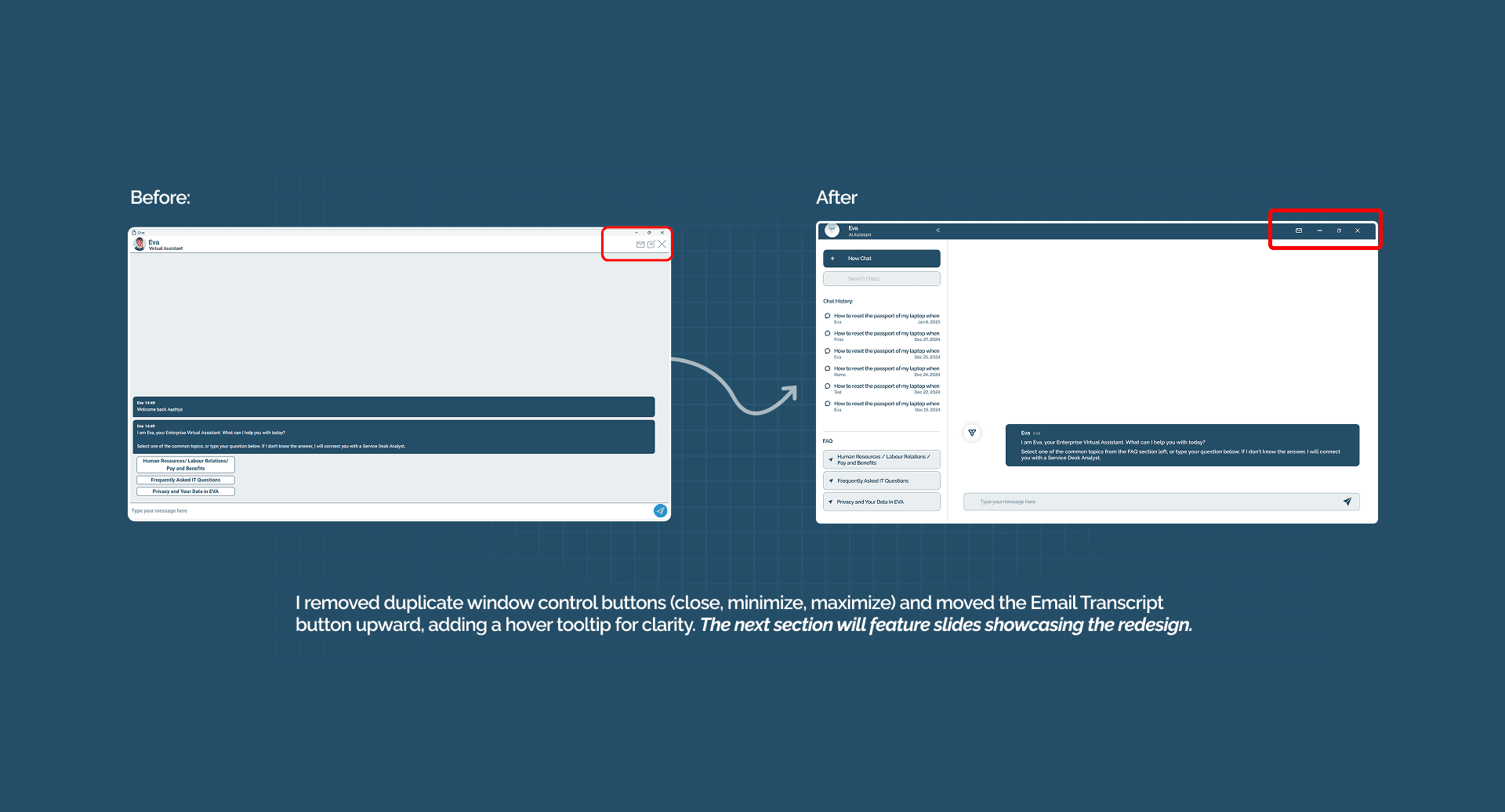
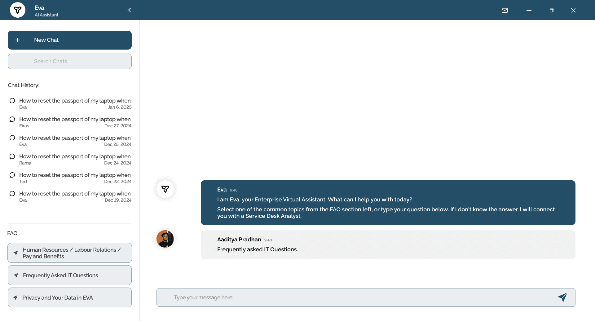
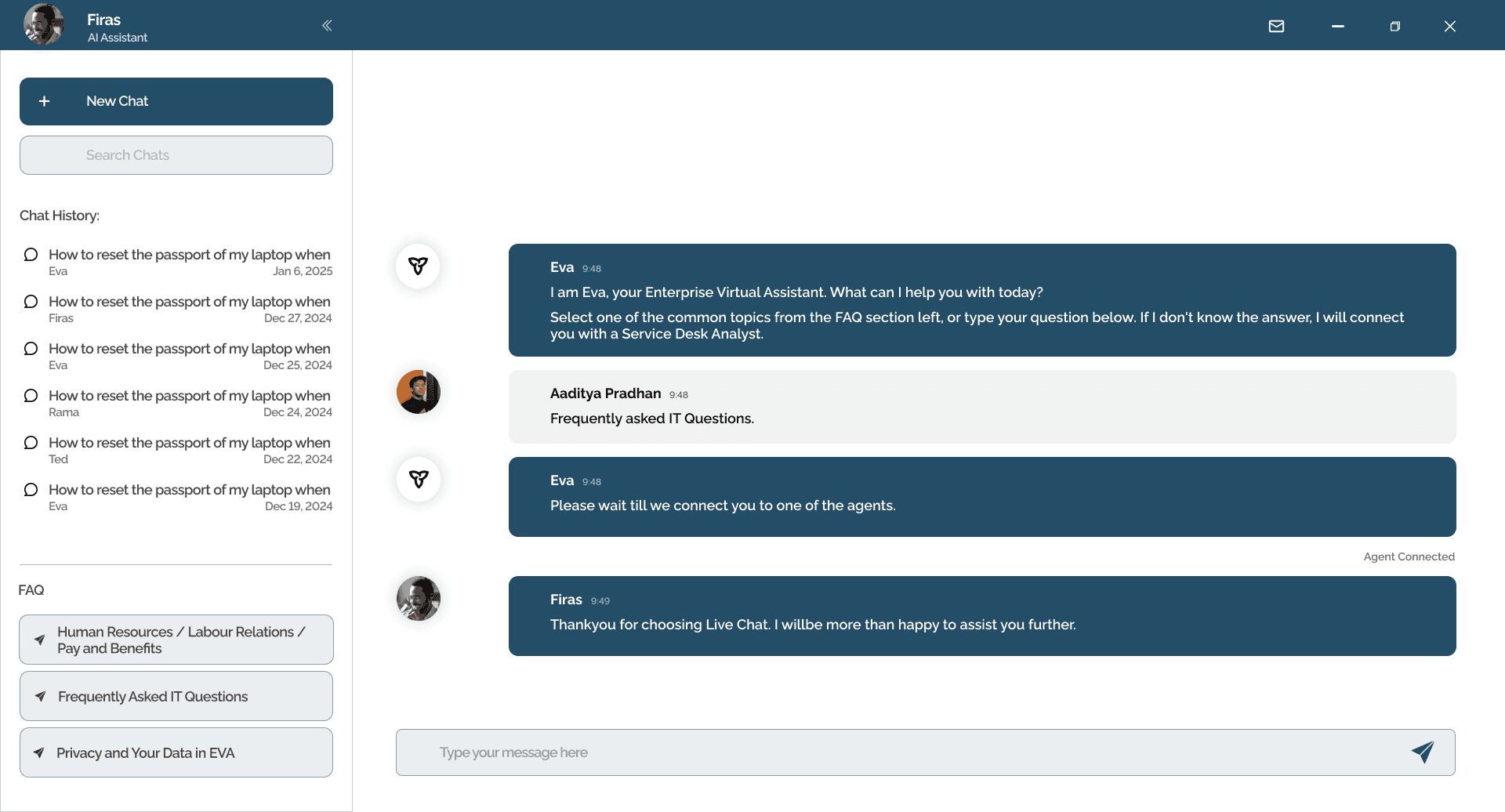
Ask Eva - Rethinking OPS’s Internal AI Chatbot
In my onboarding week, I saw that Ask Eva, OPS’s internal AI chatbot, struggled with clunky visuals, unclear flows, and hard-to-find answers. I quickly connected with developers, tested queries, gathered feedback, and designed a proposal with usability fixes, a cleaner interface, and better conversation structure.
The deck reached multiple managers and senior leadership, showing how early gap-spotting and cross-team collaboration could improve adoption, cut repetitive IT requests, and help staff get answers faster even as an exploratory initiative.